eyetracking to detect 'usability'
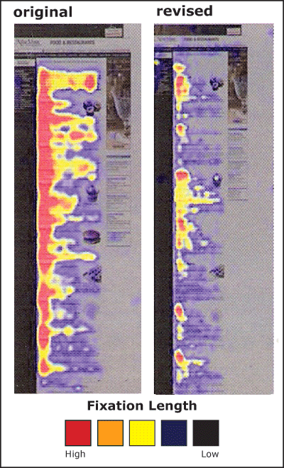
These thoughts and accompanying googling led me to interesting work summarized in Online Journalism Review, in which are suggested ways to make online and print material easier to read and recall. These are based on eyetracking research, and the article has cool graphics showing which areas of a page/screen receive more intense scrutiny before and after revision:
While I'll refer the interested reader to the OJR article for key recommendations, one couldn't help but snicker at the following tidbit on how men and women (ostensibly randomized with respect to sexual orientation) differ among themselves in the way they view photos:
"When photos do contain people related to the task at hand, or the content users are exploring, they do get fixations. However, gender makes a distinct difference on what parts of the photo are stared at the longest... [a]lthough both men and women look at the image of George Brett when directed to find out information about his sport and position, men tend to focus on private anatomy as well as the face. For the women, the face is the only place they viewed. Coyne adds that this difference doesn’t just occur with images of people. Men tend to fixate more on areas of private anatomy on animals as well, as evidenced when users were directed to browse the American Kennel Club site." [emphasis mine]
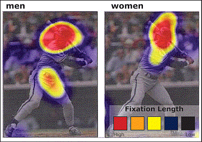
While blogger Jason Kottke wonders about the evolutionary interpretation of such gender differences, what I want to know is: what were the researchers thinking when they planned to include the AKC treatment in their experimental design?
posted by L. Ramakrishnan at 5:21 PM
![]()
![]()

3 Comments:
Very interesting.
This is probably why résumés nowadays have a band on the left containing the salient details in keywords.
that was an interesting piece of info..but i dint get how exactly it gelps in the documentaion bit...do u mean the color codes?
Anoodha: the relevant part was how to design documents that for maximum readability. The part on gender differences in how people look at photos was just a sidenote.
Post a Comment
<< Home